
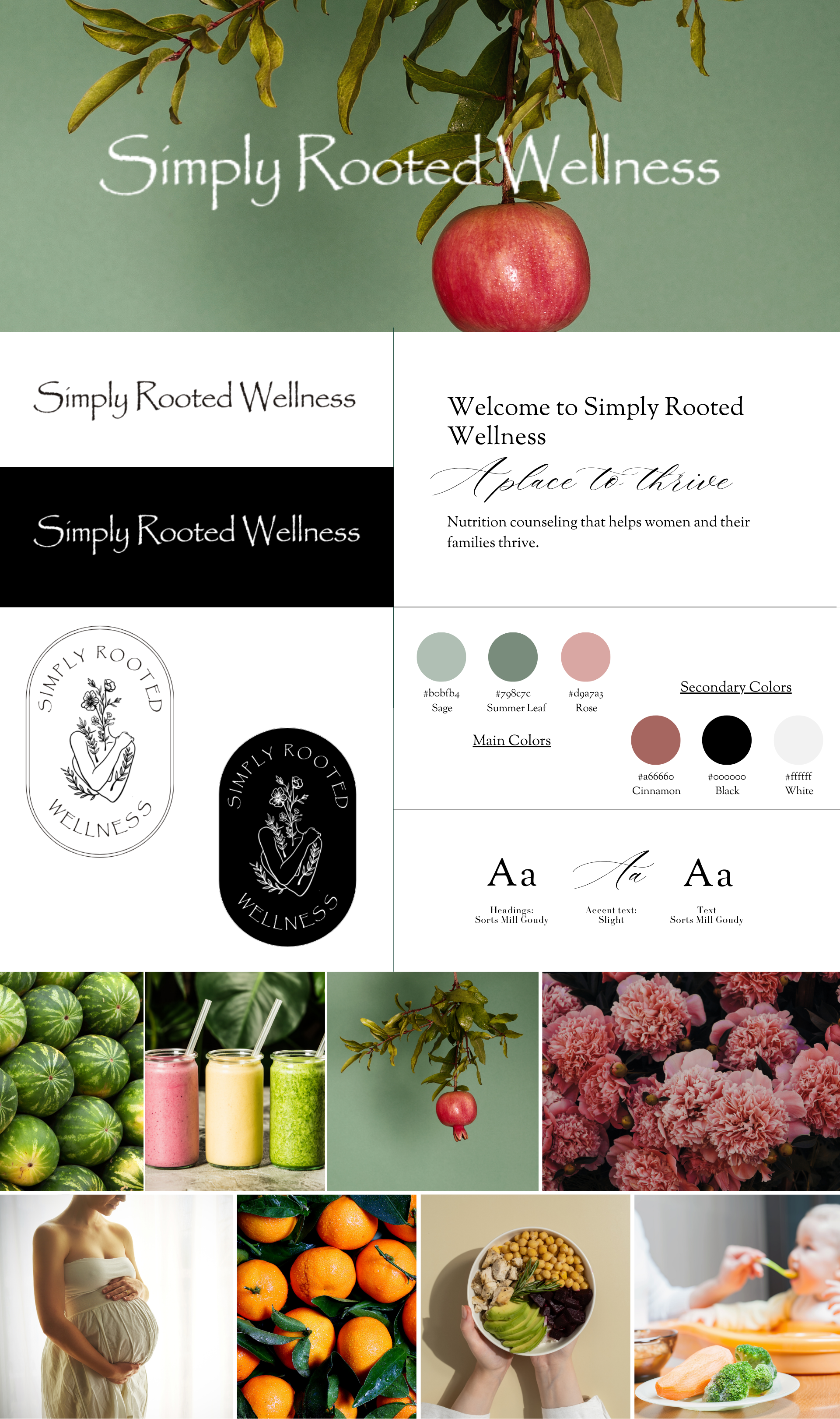
Simply Rooted Wellness
Brand identity & website build for a nutritional coaching business helping women & their families thrive.
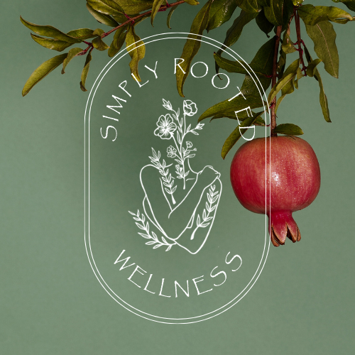
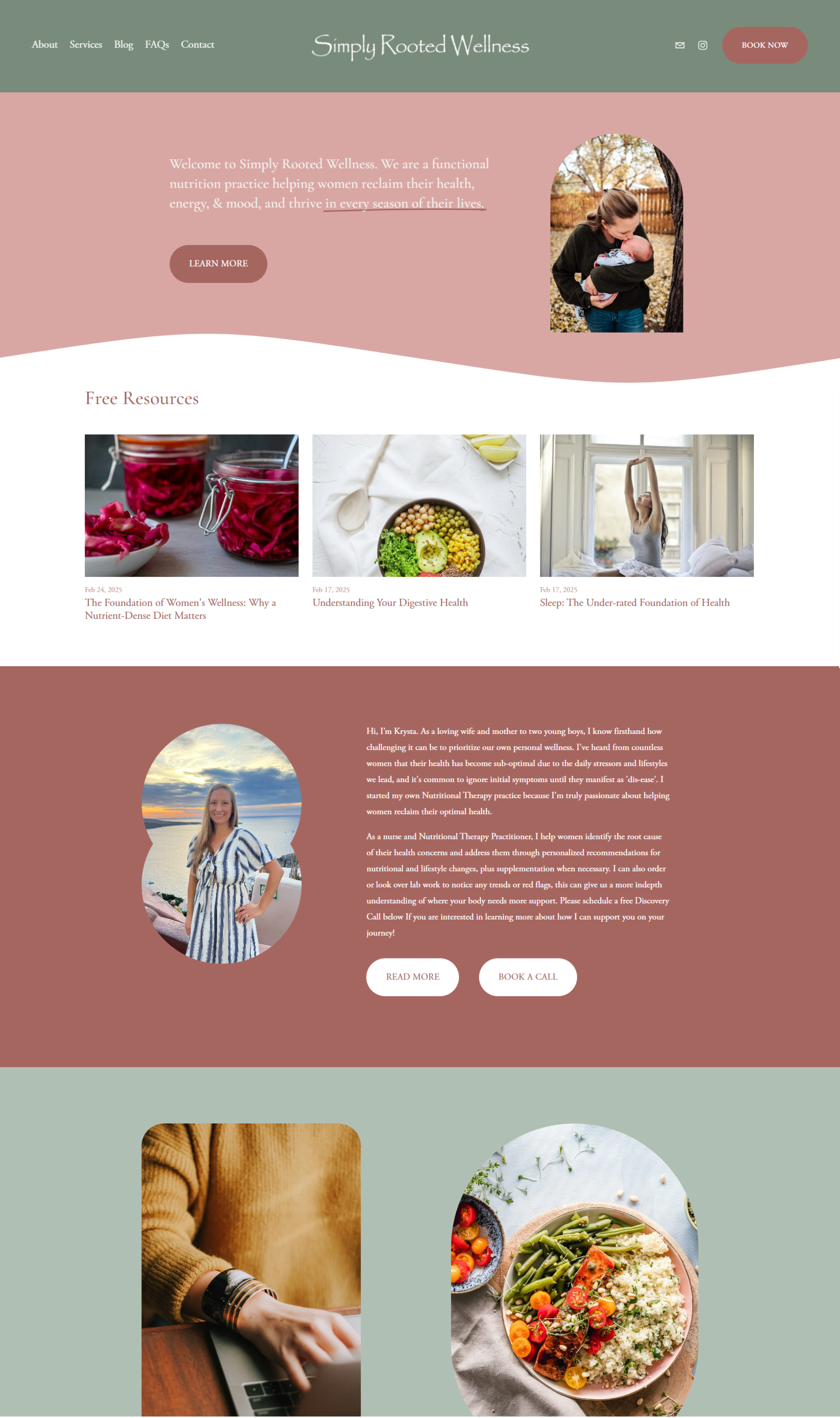
LOGO / BRAND IDENTITY / PRINT & PACKAGING DESIGN / NAMING / FULL WEBSITE DESIGN & BUILD IN SQUARESPACE
Simply Rooted Wellness is a nutrition counseling service helping women and their families thrive. When I first started working on this project, I realized so many of these types of services that are geared towards women’s wellness all look the same. The cursive font. The pink and white tones. The outdated millennial aesthetic.
My goal with this was to please my client but also deliver a brand identity that stood out within the wellness space. I think we hit the perfect balance. And hear me out: I think it’s time to bring back the Papyrus font. I know it’s a controversial view, but I think it feels a little bit nostalgic now, in the best way.
See the full website here: https://www.simplyrootedwellnessco.com/